Publication-Quality Plots with Matplotlib
Sometimes, it makes me sad to see so many ugly plots in papers and student reports—and I’m not talking about things that could be regarded as subjective, like an aversion against pie charts, 3D bar plots, or the rainbow color palette. I’m talking about rescaled pixel graphics with unreadable axes labels, which—I would argue—are objectively crap.
As a student/researcher/engineer, who communicates his results mainly with graphs, it is worth to sit down for an hour and get this right—once and forever.
It is really not too hard, the work flow to generate a nice graph is
- determine the graph’s final size
- create the graph in correct size, using the font family and font size of the main document
- insert the graph in the document without rescaling
OK, so let’s do this.
Determine the Final Size
To determine the plots final size in the document, I created a placeholder PDF with nothing but a brown background. Its size doesn’t matter, it will be rescaled to fit the adjusted width. (This is, btw, exactly what we want to avoid for our final graph.)
Then, insert the placeholder PDF in the document. If you want it to fill one column, this will be something like
\begin{figure}
    \includegraphics[width=\columnwidth]{placeholder}
    \caption{This is a placeholder to measure the width of a plot. Its with is set to \texttt{columnwidth}.}
\end{figure}
Generate the PDF and open it in Inkscape. When you double click on you placeholder you can see its dimensions in the top bar. Since, Matplotlib measures sizes in inches, it’s easiest to switch to inches.
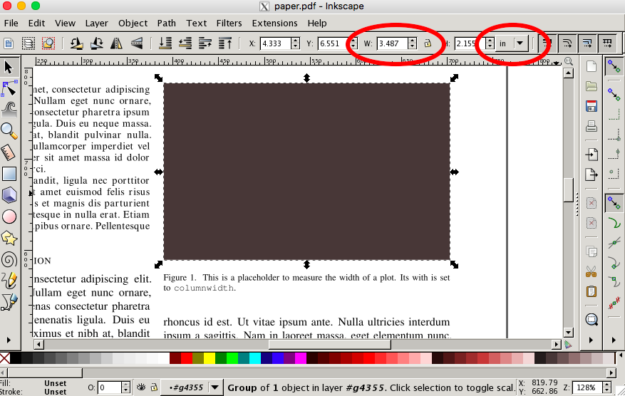
Note, that we are only interested in the width. The aspect ratio can be chosen to you likings and might depend on what you are going to plot.
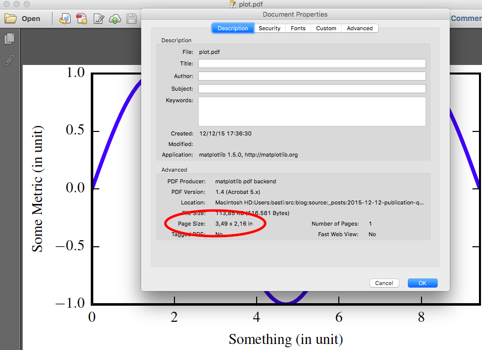
Some people recommend to use the golden ratio (1.618), which I also found to produce nice looking plots. For a one column figure in an IEEEtrans paper, I had
width  = 3.487
height = width / 1.618
Also with Inkscape or the LaTeX style file, you can determine font family and size of the text. With IEEEtrans, my document uses 10pt Times for the main text and 8pt Times for figure captions.
Create the Plot
With this we have all information to create the plot. In this example, I used
import numpy as np
import matplotlib as mpl
mpl.use('pdf')
import matplotlib.pyplot as plt

plt.rc('font', family='serif', serif='Times')
plt.rc('text', usetex=True)
plt.rc('xtick', labelsize=8)
plt.rc('ytick', labelsize=8)
plt.rc('axes', labelsize=8)

# width as measured in inkscape
width = 3.487
height = width / 1.618

fig, ax = plt.subplots()
fig.subplots_adjust(left=.15, bottom=.16, right=.99, top=.97)

x = np.arange(0.0, 3*np.pi , 0.1)
plt.plot(x, np.sin(x))

ax.set_ylabel('Some Metric (in unit)')
ax.set_xlabel('Something (in unit)')
ax.set_xlim(0, 3*np.pi)

fig.set_size_inches(width, height)
fig.savefig('plot.pdf')
Some parts might be noteworthy:
We use the PDF backend and store the plot as PDF
The font family and size are set to 8pt Times like the figure captions in the main document.
It uses LaTeX to render the plot. This allows to use LaTeX math notation in axes labels and annotations.
To make the script self-contained we set the parameters directly, but you could also use a matplotlib style sheet that can be imported in all your plots. See here for the style sheet format. To import it, replace the RC settings with
plt.style.use('mystylesheet.mplrc').The figure is resized to the calculated dimensions just before saving.
Use the
subplots_adjustfunction to manually set the size and placement of the main patch. Unfortunately, matplotlib cannot do this for you as it cannot know the final dimensions of the axes labels after rendering them in LaTeX. Therefore, if your plot does not use the whole size, or if the axes labels are hidden you have to change adjust the margins.
Pitfall
Do not use the tight layout, as it does not play well with this work flow and will mess with your figure size.
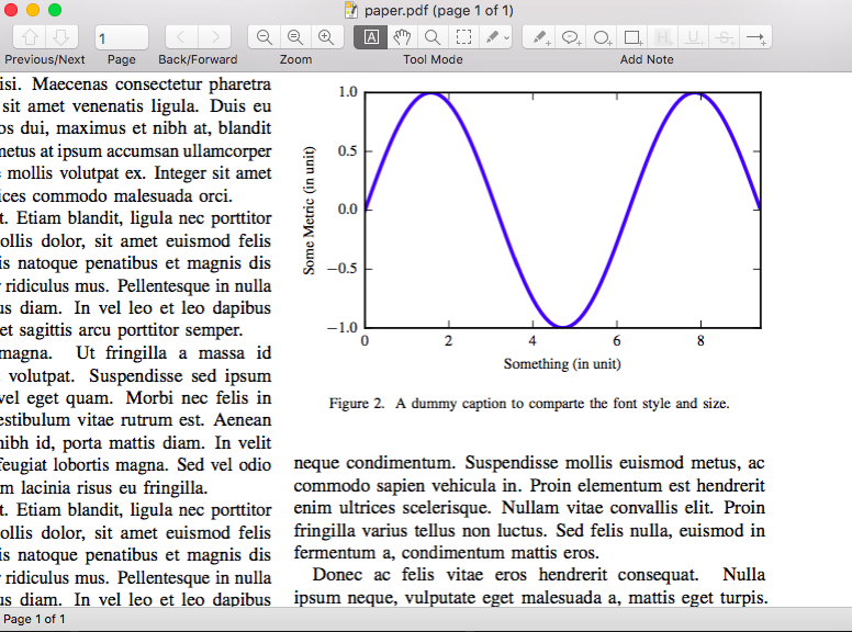
The final result should be a plot with the correct dimensions, which you can check with any PDF reader.
Insert into Document
Now, since the plot already has the correct dimensions, it will not be rescaled when put in the document. Therefore, also the font size will not change and we have an awesome looking graph in our paper.
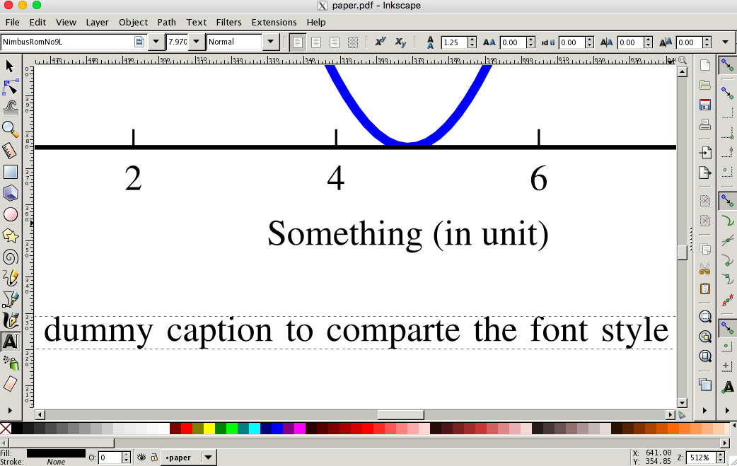
…and another close-up in Inkscape. Beautiful